Friday, December 7, 2012

Spring 2013!


Mmmmmmmmm.   Data.

I am updating my description of Data Analysis for Spring semester.  The course will be a bit different than it was, but in short, we will be doing projects, starting with collecting data using an online survey, recoding data using excel formulas, doing simple analyses in excel, and then working with larger scale datasets in R.  Throughout we will work on learning how to work with data, perform standard analyses, and understand what the analysis means.  Everyone will do actual factual projects using those larger and very real datasets.

Here are some details that you should know about:

You should buy a copy of "Discovering Statistics Using R".  In fact, you should get it as a "Christmas Present" or any other seasonally defined gift for yourself.  I know, what could be more exciting?  Not much!

Here are lectures on Stats from the author of the book, Andy Field.
https://www.youtube.com/user/ProfAndyField
Add them to your late list of youtube infotainment options.

There are some online resources related to the book: http://www.sagepub.com/dsur/study/default.htm
I am not sure if I am going to want to use any of those, but thought you might want to know that they are there.

I will be updating the content of our course, the schedule, and the assignments.
https://sites.google.com/site/professorwelser/courses/data-analysis

Wednesday, June 6, 2012

Website for regression analysis

This website was extremely helpful to me doing my regression analysis.  Hope it is helpful to you!

http://www.montefiore.ulg.ac.be/~kvansteen/GBIO0009-1/ac20092010/Class8/Using%20R%20for%20linear%20regression.pdf

Recoding Variables

This post is a combined effort of Megan H, Denise M, and Steven B. 

In case you are in the middle of recoding your data here are some tips and an example from our paper and syntax.  First when you recode the data you need to find a way to make your independent variables coded the same.  As seen below we decided to take a number of different survey questions and code them 0-2.  This gave us a chance to categorize the people into categories despite the questions asking different things.  In our example there are three different types of questions being asked but we were able re-code them so we could measure and compare the variables with one another.  This is at the discretion of the researcher but when you do this you should explain why you coded it as you did.   This is our example from our paper. 


In our study we have decided to code all of our independent variables on a 0-2 scale. 0 codes as a non- gamer, 1 as a moderate gamer, and 2 as an extreme gamer.  We decided these measurements were best to get measurable and meaningful results for our research.  We have five independent variables for our study that all have to do with playing computer or internet games. 

First, Xbox live, was measured, originally in the survey each respondent was asked their status of X-box live with the following options, Never Used; Previous User; Currently Active.  We decided to code never used as a zero (non-gamer), previously used as a 1 (moderate gamer), and currently active as a 2 (Extreme Gamer)

Students were asked the same question about World of Warcraft was asked, measured, and coded in the exact same format of x-box live. 
Students were asked in general if they played computer games or not on the survey given.  We coded those who do not as a 0.  We coded those who do as a 2.

Student who originally completed the survey was asked how often they played Facebook Games, the possible responses were  Hourly; Several times a day; Once a day; Several times a week; Once a week; Rarely; Never.  We coded this on the 0-2 scale as well, Never and non-applicable were coded as 0, and, rarely, once a week, and several times a week were all coded as a 1,  Once a day, several times a day, and hourly were all coded a 2.

Students were also asked how frequently they played Internet games in general.   This question had the same possible responses as Facebook games and we coded it the same as Facebook games.

This was our syntax for recoding, Check your syntax for what numbers were originally coded in order to re-code.  If your codebook is not clear you can run summaries and histograms of the variables to try to find out what the code is.  

 S1.SNS.XboxLive<-recode(S1.SNS.XboxLive, "1=0; 2=1; 3=2")
S1.SNS.WoW<-recode(S1.SNS.WoW, "1=0; 2=1; 3=2")
S1.OUT.GameCon<-recode(S1.OUT.GameCon, "NA=0; 7=2")
S1.CU.Games<-recode(S1.CU.Games, "NA=0; 2=2")
S1.FBU.Game<-recode(S1.FBU.Game, "7=0; NA=0; 6=1; 5=1; 4=1; 3=2; 2=2; 1=2")
S1.IU.Games<-recode(S1.IU.Games, "7=0; NA=0; 6=1; 5=1; 4=1; 3=2; 2=2; 1=2")

Check that your re-codes are accurate when you are finished recoding by running histograms of the variables to make sure your recodes were accurate.  This helped us spot multiple mistakes we made before our re-codes were finally done correctly

Correlation Tables in R flagged with significance level stars (*, **, and ***)

If you want to create a lower triangle correlation matrix  which is flagged with stars (*, **, and ***) according to levels of statistical significance, this syntax may be helpful (found it here). All you have to do is cut and paste into R and insert your data table. You will need the Hmisc and xtable packages.

corstarsl <- function(x){ 
require(Hmisc) 
x <- as.matrix(x) 
R <- rcorr(x)$r 
p <- rcorr(x)$P 

## define notions for significance levels; spacing is important.
mystars <- ifelse(p < .001, "***", ifelse(p < .01, "** ", ifelse(p < .05, "* ", " ")))

## trunctuate the matrix that holds the correlations to two decimal
R <- format(round(cbind(rep(-1.11, ncol(x)), R), 2))[,-1] 

## build a new matrix that includes the correlations with their apropriate stars 
Rnew <- matrix(paste(R, mystars, sep=""), ncol=ncol(x)) 
diag(Rnew) <- paste(diag(R), " ", sep="") 
rownames(Rnew) <- colnames(x) 
colnames(Rnew) <- paste(colnames(x), "", sep="") 

## remove upper triangle
Rnew <- as.matrix(Rnew)
Rnew[upper.tri(Rnew, diag = TRUE)] <- ""
Rnew <- as.data.frame(Rnew) 

## remove last column and return the matrix (which is now a data frame)
Rnew <- cbind(Rnew[1:length(Rnew)-1])
return(Rnew) 
}

##Create table _insert your dataframe below
New_table<-corstarsl(yourdataframe)


## exporting tables to either html or .tex (I prefer .tex but you will have to install TeX)

print.xtable(newtable, type="latex", file="filename.tex")
print.xtable(newtable, type="html", file="filename.html") ## see here for formatting tips

Monday, June 4, 2012

Comparison of Data Analysis Packages

This is a link to an interesting page I found that compares different statistical packages...

http://brenocon.com/blog/2009/02/comparison-of-data-analysis-packages-r-matlab-scipy-excel-sas-spss-stata/

For me, reading this made me grateful for being exposed to R, but also learning other programs as well.  To me, it largely depends on what you're trying to do that makes one program better to use than another.

Matched Sets of Graphs in R

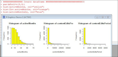
Sometimes you may want to see grpahs side by side in R.  To accomplish this you can use the function

par(mfcol=c(2,4))

You can change the numbers within this function depending on how mnay graphs you want to appear together and which ones you want next to each other.  The first number specifies the number of rows of graphs that will appear, in this case 2.  The second number specifies the number of graphs that will appear in each row, in this case 4.
Hi guys,

 Just some quick input on how to do Poisson regression which is a form of regression when you have a count variable. It is very simialr to using binomial regression except you use the code

summary(regress<-glm("Y-variable"~"X-variable1"+"Xvariable2"+... +"X-variableLAST", family=poisson)

Make sure you have the program "car" uploaded and that should work.


This should give you your quartiles, your coefficients, standard error and significence along with your null and residual deviance to calculate the pseudo R^2

hope that helps!

Almost done!


Spring quarter of 450/550 is almost done! 

Things to do:


  1. Make sure that you have your participation all squared away.   This means: 
    1. double check that you watched at least a couple of Khan academy videos on relevant topics (while logged in to the account where you selected me as a coach). 
      1. Right now Shanique and Nathan have plenty of Khan academy views on their accounts.
      2. But other folks who   
    2. Make sure that you created your two videos.
    3. Make sure that you made at least one helpful blog post. 
    4. I have record from class attendance and my subjective sense of in-class participation. 
    5. Make sure too that you have tagged your contributions to
      1. helpful links page
      2. crash course in statistics
      3. anywhere else?
  2. Take a look at the updated turn in form for the HW.
    1. Just turn in one project for your group. 
    2. Any questions?
  3. I will be in the lab starting at Mon (2:00) and Tues (10:00).
    1. You are encouraged to show me your progress.


Tuesday, May 29, 2012

Finding the "Top Dogs": Recoding for the Top Quartile (in R)


This post deals with separating out the top (or bottom) quartile of a given variable.

As part of our final project, my group redefined the concept of opinion leaders in the diffusion study our class looked at. (Which is more for background information than anything else, but it may help to understand similar situations in which this kind of recoding could come in handy.) Previously this study had defined opinion leaders (think “the cool kids that everyone wants to be like”) as those with admin status on the site (in this case Wikipedia). We added a couple more variables: barn stars (awarded by peers/other Wikipedia editors), and the number of edits to their user profile page. It’s this “user edits” variable that we’re concerned with in this post.
  
Since the original dataset had data from various timeframes, we decided to create three new variables delineating the number of user profile pages before and during the study’s time period, as well as one adding both together.

First we had to create an index which combined the "Pre" and "Period" timeframes into a "Both" variable, thusly: 

userEditsBoth<-(userEditsPre+
userEditsPeriod)

Next we ran a summary of the “userEdits” (for each of the timeframes described above) variable to find the values of the upper quartile.  The syntax looks like this:

summary(userEditsPre)
summary(userEditsPeriod)
summary(userEditsBoth)

The results looked something like this:


> summary(userEditsPeriod)
   Min. 1st Qu.  Median    Mean 3rd Qu.    Max. 
   0.00    0.00    1.00   12.56    8.00 3239.00 

See the 8.00 under "3rd Qu." and then 3239.00 under "Max."? That's where we got the values to use in the "highuserEditsPeriod" below. Simple enough. We recoded as a binary variable with just the top quartile of values = 1 and the rest = 0. Like this:

highuserEditsPre<-recode(userEditsPre, "51:6143='1'; else='0'")
highuserEditsPeriod<-recode(userEditsPeriod, "8:3239='1'; else='0'")
highuserEditsBoth<-recode(userEditsBoth, "66:9382='1'; else='0'")

(Yes, someone really did make 3,239 edits to their profile page in a single month. I know!)


You cannot remain unhappy when you look at the lowl.

After that, we were able to use this new variable (highuserEdits...) in the index for our new variable that redefines opinion leaders in this study (to examine whether they were more or less likely to adopt a new tool to suggest pages for them to edit).

But that is another story…

The members of the group involved in this class project are Heather Dumas, Bree Stewart, and Xuan He. 

Tuesday, May 22, 2012

Understanding how to visualize data onto graphs

With our assignment for homework 3/4 we have to get familiar with one of the data sets and R and then extend the analysis of the data by using R. To do this we have to understand how to look at data and then visualize it in graphs to help us better understand correlations. I found a few helpful videos on Khan Academy to help understand how we visualize data in graphs. This may seem too basic for some people in the class but it was helpful for me at the level I am at in my understanding of data analysis.

http://www.khanacademy.org/math/algebra/ck12-algebra-1/v/histograms

http://www.khanacademy.org/math/algebra/linear-equations-and-inequalitie/v/interpreting-linear-graphs


Friday, May 18, 2012

HW 3/4 work items


In class on Tuesday I mentioned several things for you to work on this weekend.  Here is a list and a note about some resources that I uploaded.


  1. Resources: 
    1. The codebooks for both datasets are shared in your google doc folders, and are linked on the crash course in statistics page. 
    2. The three chapters from the stats book are linked on that page as well.  They ought to help you understand how regression is used and what the results mean.
      1. I added the third chapter Friday (on multiple regression)
  2. Tasks
    1. Read the chapters on regression.
    2. Get more familiar with R code used in the Adoption research.
      1. use the example code.
      2. read the code to figure out what the parts do
    3. Start building your version of the code in a text file or R syntax file
      1. advantage of text file:  R crashes
        1. When R crashes, the notepad does not. 
      2. come to class on tuesday with commented code that you made this weekend!
    4. Work with the sections on:
      1. histograms (as demonstrated in class and the recent video)
      2. correlation matrices
      3. regressions
      4. other stuff
    5. Find Adil's posts on this blog.
      1. read the posts, and copy the syntax from his examples
      2. apply that code to the data from the Adoption example
      3. document and comment your new code
    6. Make sure you make progress on your participation
      1. log in to Khan academy and watch relevant videos (unless you already have viewed plenty of them while logged in)
      2. create at least 1 valuable post to the blog.  (see Adil's examples)
    7. Read the papers and look at the slide presentations for the example study that you will work with for your assignment. 
      1. Start figuring out what your extension study will do.
    8. Anything else?

Home office productivity


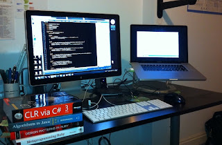
  1. Besides the cheerful expressions, notice the amount of screen space at each work station.
    1. Higher.productivity<-screenspace(second.monitor)
    2. Efficient.Cost.Effective<- Laptop.station(monitor +external keyboard +mouse)
      1. see below.  (not my setup, but this is the idea)


Thursday, May 17, 2012

Looking at data transformations


The most recent video gives some instructions for working with the adoption of innovation data.

The video asks you to compare the distributions of the raw, inverse transformed, and logged versions of three different count variables used in the diffusion of innovation paper.


Sunday, April 29, 2012

Multiple Plots on a Single Graph using ggplot2


I was trying to put multiple plots on a single graph using ggplot2; however,
It turned out that R built in par(mfrow=c(2,2)) doesn't work for ggplot2.
When I searched online i found this POST that illustrates how to do that.

It is very simple. For ggplot2, instead of using par(mfrow=c(2,2)), you need to use grid.arrange( graph1, graph2...., ncol=2)
However, grid.arrange() is a function of a package called "gridExtra", so first you have to install
gridExtra package.

Here are some examples based on our survey data (you can copy the following code) :-

install.packages("gridExtra")
library(gridExtra)
graph1 <-  qplot(Ind7_Confidence, data=myIndices, geom= "histogram", color=I("blue"),
fill=I("orange"),main="Software Use")


graph2 <- qplot(Ind5_WeightedMathAbility, data=myIndices, geom= "histogram", color=I("blue"),
fill=I("skyblue"),main="Weighted Math Ability")


graph3 <-qplot(Ind2_UnderstandingDataAna, data=myIndices, geom= "histogram", color=I("blue"),
fill=I("yellow"),main="Understanding Data Analysis")


graph4 <- qplot(Ind4_PractQuanMethod, data=myIndices, geom= "histogram", color=I("blue"),
fill=I("red"),main="Practical Quant Experience")
grid.arrange( graph1, graph2,graph3,graph4, ncol=2)
savePlot(filename="Gridhist.png",type="png")


Another Example using Density Plot

graph1 <- qplot(Ind7_Confidence, data=myIndices, geom="density",
fill = TwoPlusComputers, alpha = I(0.2),xlab="Data Analysis Confidence")


graph2 <- qplot(Ind8_ComSocialUse, data=myIndices, geom="density",
fill = TwoPlusComputers, alpha = I(0.2),xlab="Computer For Social Use")


graph3 <- qplot(Ind3_PractQualMethod, data=myIndices, geom="density",
fill = TwoPlusComputers, alpha = I(0.2),xlab="Practical Experience of Quant Methods")


graph4 <- qplot(Ind9_ComWorkUse, data=myIndices, geom="density",
fill = TwoPlusComputers, alpha = I(0.2),xlab="Computer For Prof Use")
grid.arrange( graph1, graph2, graph3,graph4, ncol=2)
savePlot(filename="GridDensity.png",type="png")


Adil 

Saturday, April 28, 2012

WORKING WITH MISSING VALUES IN R


 SUBSTITUTE  ALL MISSING VALUES WITH MEANS IN FEW LINES

In this post I will illustrate what I did to deal with missing values in our survey dataset.
If you believe that using mean substitution  to deal with your missing values, then this post may be useful to you. However, if you are looking for imputation methods, then you can use built in functions in R to generate your own algorithms for missing data imputation or you can install some packages like 'imputation',' amelia','robCompositions'

I divided the dataset into two datasets: data1: has only columns without missing and data2: all columns with missing values (NA), I then worked with those columns with missing values. I excluded all categorical variables from data2, because i wanted to substitute mean for continuous variables. However, for NA of categorical variables i replaced NA with 99. After i have cleaned missing values in data2, i combined data1 and data2 in a single data frame which was clean data without any missing values. 

The code i wrote to do this is:-

is.na(survey[])
onlyMissingCol <- survey[,!complete.cases(t(survey))]
onlyMissingCol
NA_Col <- survey[sapply(survey, function(survey) any(is.na(survey)))]
NA_Col
No_NA_Col <- survey[sapply(survey, function(survey) !any(is.na(survey)))]
No_NA_Col
NA_Col$Ethnicity
NA_Col2 <- as.matrix(NA_Col)
NA_Col2[which(is.na(NA_Col), arr.ind = TRUE)] <-
apply(NA_Col2,2,mean, na.rm=T)[which(is.na(NA_Col), arr.ind = TRUE)[, "col"]]
survey_clean <- data.frame(No_NA_Col, NA_Col2)
survey_clean
complete.cases(survey_clean)
survey_clean1 <- round(survey_clean[,c(-3)],digits=2)
options(width=1000)
survey_clean1
survey_final <- data.frame(Std_ID=survey_clean$Std_ID, survey_clean1)
survey_final

If you want wonder what the above code does then click HERE to see the comments I wrote for each command line. You can also run it because i linked it to my dataset on dropbox.

I hope you find this useful.

ADIL

How to write, save, and call your own functions in R With an Example


·         How to write?
                General form of function is
NameOfFun <- function(argument1,argument2...)
            {
                        Your expressions go here
            }
name <- function(x,y,..)
            {
                        if(.....) do something to x and or y
                        if(.....) do something to ............
            }
·         How to save?
                1- From R, write or paste your function code in R Editor or R script
                2- Save your function as "nameOfFile.R" in your working directory
                               
·         How to Call?
1-  in R Console type source("nameOfFile.R")

I have written a function that automatically assign letter grades. You can copy the function from
Or you can follow the following steps that may help you to know how to call a function:-
1- Download the function from
2- Unzip the folder and copy the file "GradingFunction.R" into your working Directory
3- Go to R, and type
source("GradingFunction.R") to call the function
4- If you are a TA and would like to try the function in your classes, follow the arguments of function as explained here
5- I have also randomly generated grades if you wish to try the function. There are two examples from the above link.

Note: This function may not directly related  to Data Analysis, but the process is the same (e.g., you want to assign labels into your grouping variables if conditions satisfied) 

Adil

Friday, April 27, 2012


I'm just replicating Professor Welser's post on TUESDAY, APRIL 24, 2012
"Plot different characters and colors according to factor on third variable"

The only difference is that i used ifelse statement Instead of subsetting data. I created a grouping variable (Geek/Non) that was automatically added to the existing dataset
by using ifelse()

#survey_final$TwoPlusComputers<- .... this adds a new colomn  into your existing data (e.g., myIndices)
#1 or less = non; 2 or more = Geek
#factor() is like the levels of categorical variable in spss
myIndices$TwoPlusComputers<- factor(
ifelse(survey_final$computers <= 1,0,1),
  levels=c(0,1),
  labels=c("Non-Geeks","Geeks"))
#now you have a new colomn called TwoPlusComputers added to your Indices/data

#you can now use coplot based on the illustration of Prof. Welser
#coplot ( y ~ X | Z)

# you can also use ggplot2
#if you don't have ggplot2, run the following
#install.packages("ggplot2")
library(ggplot2)

#qplot(x,y,data=yourdata,....)

#I. BY COLOR
qplot(Ind6_Software,Ind7_Confidence, data=myIndices,
size=factor(TwoPlusComputers), size=I(4),
xlab="# Of Software Used",
ylab="Confidence Analyzing Data",
main="Software predicts overall confidence (Geeks Vs Non)")


#II. BY SIZE
qplot(Ind6_Software,Ind7_Confidence, data=myIndices,
size=factor(TwoPlusComputers), size=I(4),
xlab="# Of Software Used",
ylab="Confidence Analyzing Data",
main="Software predicts overall confidence (Geeks Vs Non)")


#III. BY SHAPE
qplot(Ind6_Software,Ind7_Confidence, data=myIndices,
shape=factor(TwoPlusComputers), size=I(4),
xlab="# Of Software Used",
ylab="Confidence Analyzing Data",
main="Software predicts overall confidence (Geeks Vs Non)")

I have also created 3 more grouping variables, one of them is that i was looking whether students' career goals predict confidence of data analysis. This variable is called 'goals' in our original survey data.


#Even more complex - ggplot2

qplot(Ind6_Software, Ind7_Confidence, data=myIndices,
xlab="# Of Software Used",
ylab="Confidence Analyzing Data",
main="Software predicts overall confidence (Geeks Vs Non)",
facets= .~TwoPlusComputers) + geom_smooth()


Adil

Apply functions to subsets of your data


This video explains two ways to apply functions to subsets of the data, with illustration using histograms and our example dataset / syntax, which has been updated to include this syntax, which is also copied below.


par(mfrow=c(2,3))


##   select cases to include by specifying value of factor variable

annie<-hist(AllVars$NewConf1,
col="purple",
breaks=4,
ylim=c(0,12))


ed<-hist(AllVars$NewConf1 [AllVars$TwoPlusComputer == 1],
col="light blue",
breaks=4,
ylim=c(0,12))


frankie<-hist(AllVars$NewConf1 [AllVars$TwoPlusComputer == 0],
col="pink",
breaks=4,
ylim=c(0,12))

##  select cases by refering to different datasets
## to do this you need to first use the
# AllVars<-data.frame(cbind(var, var2, varn)
# then do the subset command to make a new dataset
#  NewDataSetName<- subset(AllVars, Variable == 1)

frannie<-hist(AllVars$NewConf1,
col="purple",
breaks=4,
ylim=c(0,12))

fred<-hist(Geek$NewConf1,
col="blue",
breaks=4,
ylim=c(0,12))

frank<-hist(NonGeek$NewConf1,
col="red",
breaks=4,
ylim=c(0,12))

Tuesday, April 24, 2012

Plot different characters and colors according to factor on third variable.


Using the example dataset, and starting from running this

  1. example syntax

I added the following syntax to the Example.Syntax.450.txt file  (linked above)


##   Two ways to plot based on category in third variable.

plot(NewConf2, NewConf1, pch=as.integer(TwoPlusComputers))

plot(jitter(NewConf2, factor=2), jitter(NewConf1, factor=2), pch=as.integer

(TwoPlusComputers))

coplot (NewConf1 ~ NewConf2 | TwoPlusComputers)
#  coplot ( y ~ X | Z)
#  y= outcome variable
#  X= causal variable
#  Z= third variable with categories that cases fall into


#  A better way, perhaps


(I copied the general strategy demonstrated on the R blog, here)


AllVars<-data.frame(cbind(
NewConf1,
TwoPlusComputers,
NewConf2,
RecNumbers,
Software,
UseSPSS,
UseExcel,
UseMinitab,
UseStatistica,
UseSAS,
UseR,
UseMplus,
UseFortran,
UseMatLab,
UseStatEase,
UsePython,
UseOther,
computers,
Confidence,
DadaRecConf,
OrgDataExcConf,
CodebookConf,
RdataLoadConf,
ExcelDescConf,
RdescConf,
RexploreConf,
ConsIndexConf,
CorrMatrixConf,
OrgVarRegConf,
InterpRegConf,
ConstGraphConf,
MethoRegStuConf))

Geek <- subset(AllVars, TwoPlusComputers == 1)
NonGeek <- subset(AllVars, TwoPlusComputers == 0)

plot(NewConf1, NewConf2, type='n',

xlab = "Confidence interpreting research",
ylab = "Confidence in research techniques",

main = "Research interpretation predicts technical confidence (Geeks vrs Non)",
col.main = "#444444")
points (jitter(NewConf1) ~ jitter(NewConf2), data = Geek, pch = "G", col = "blue")
points (jitter(NewConf1) ~ jitter(NewConf2), data = NonGeek, pch = "N", col = "red")

You are invited to announce your course contributions here


We have been making videos and finding helpful links for our class.  However, it is not always easy for people to see when a new contribution has been made.   In addition to posting a link in the "helpful links" document, please consider making a brief post (like this one, with an image, or an embedded video) and a link to the resource that you are sharing.  This will make it easier for people to be alerted about the new addition.


Tuesday, April 3, 2012

Wednesday, March 28, 2012

Survey construction assignment


See this video clip for help with the participation assignment from our first day of class.

Your questions need to entered well before class on Thursday.  If you have questions ask your classmates for help or instruction.


Monday, March 26, 2012


Visit the class syllabus to find about more about Soc 450/550.


Things you can do before the quarter starts:

  1. Get / order the book (Intuitive biostatistics)
  2. Make a gmail / google account, unless you already have one
  3. Use your google account to create a Khan academy profile.
  4. Identify me as a coach (h.t.welser) 
  5. Take a look at the lessons on math and statistics in Khan academy.
    1. watch a couple that look interesting.
  6. Install R on your computer.
  7. Get your java updated to allow you to run screen cast o matic
    1. go to the screen cast o matic page
    2. try it out
  8. See you after spring break